01 — The problem
The previous e-application worked, but applicants had to work for it.
Too much asked
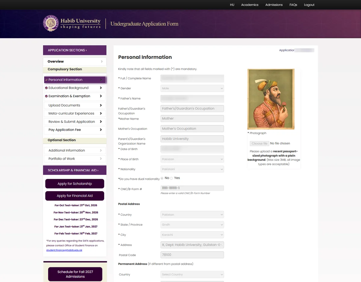
- 25 fields on one signup page
- The same details asked again in section one
- 19 upload slots, whatever your board
A journey with no order
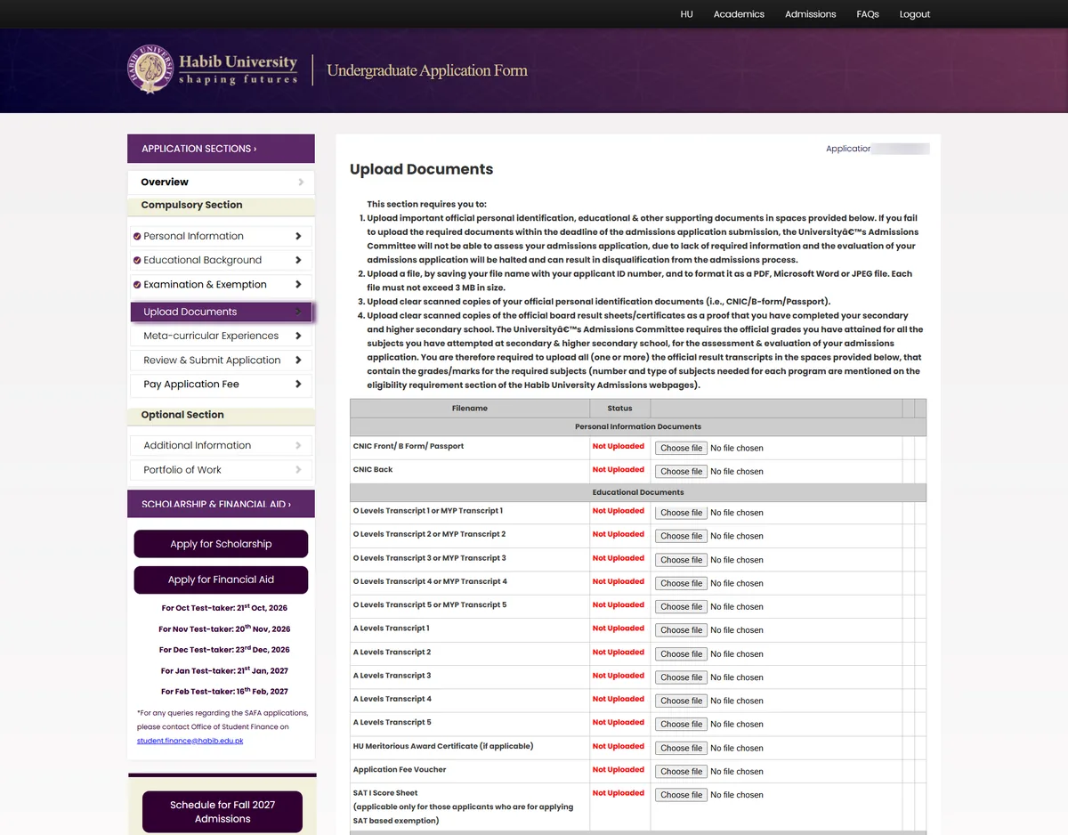
- Seven sections, open in any order
- The fee voucher and activities form uploaded inside Documents
- “Submitted” was not submitted until you paid
Sent elsewhere
- Eligibility requirements external
- Academics and prerequisites external
- Activities form template download
- Portfolio sites external
- Change a detail email
- Applicants left the flow to learn if they qualified
- Some steps ended in a download, a Word file and an upload
02 — Before & after
Eight moments, redesigned
Start with a program
Applicants pick a program first and see its requirements before they create anything.

- Choose a door before you know if you qualify
- “Click here” to begin
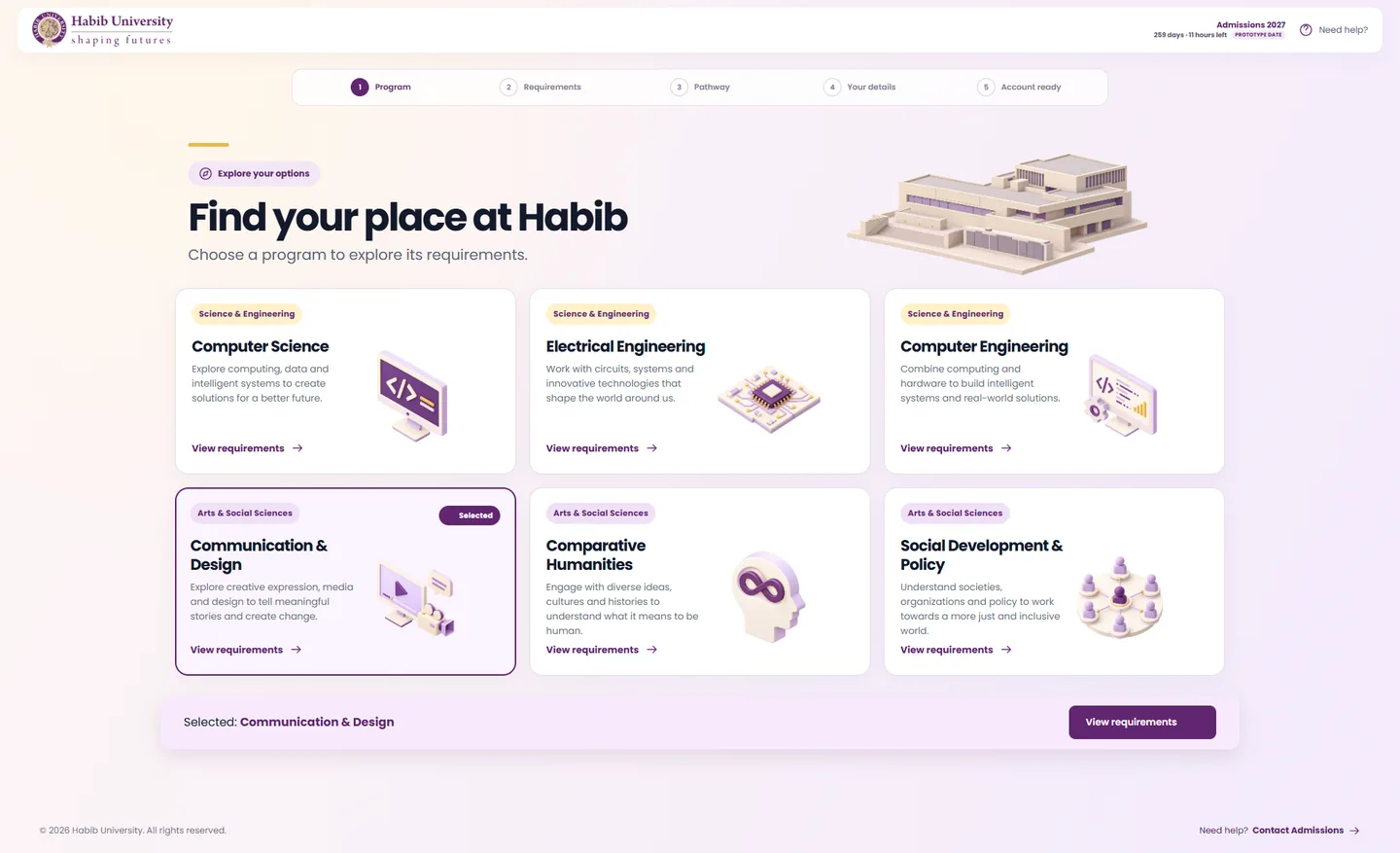
- Six programs, one tap to requirements
- Your choice follows you through the flow
Requirements, in the flow
The rules for a program live inside the application, shown for your qualification only.
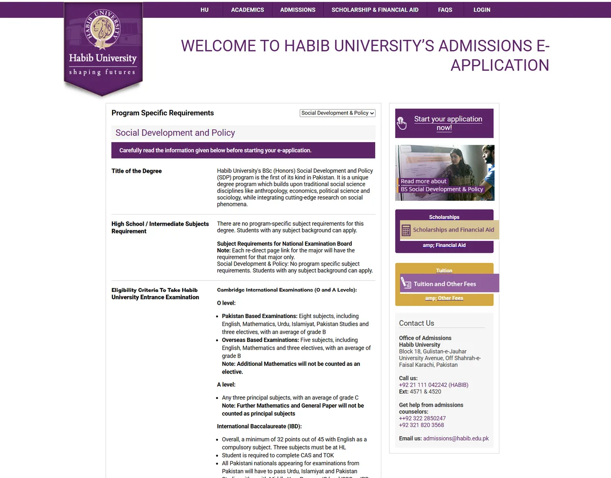
- One long page of text per program
- Eligibility pages lived outside the flow
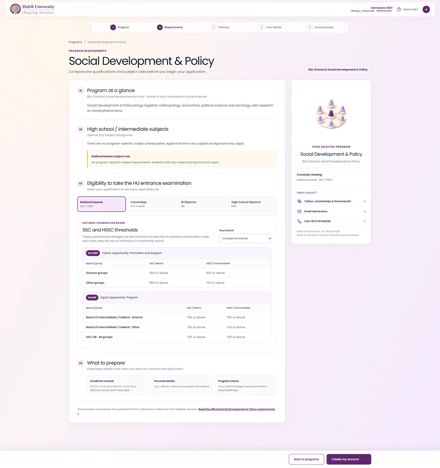
- Pick your qualification, see only its rules
- Published thresholds in clear tables
The right plan, found for you
Applicants no longer read thresholds to decide between HU TOPS and HU EOP. The plan follows from their marks.
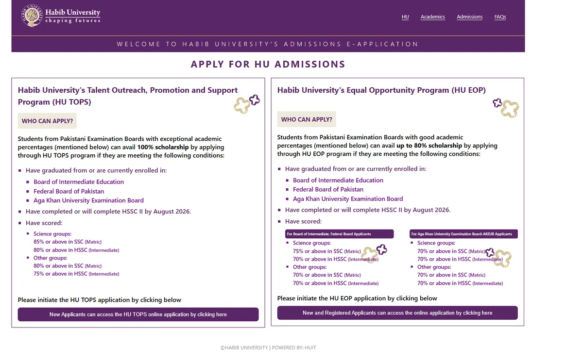
- Two programs, thresholds in bullet lists
- The applicant had to work out which fit
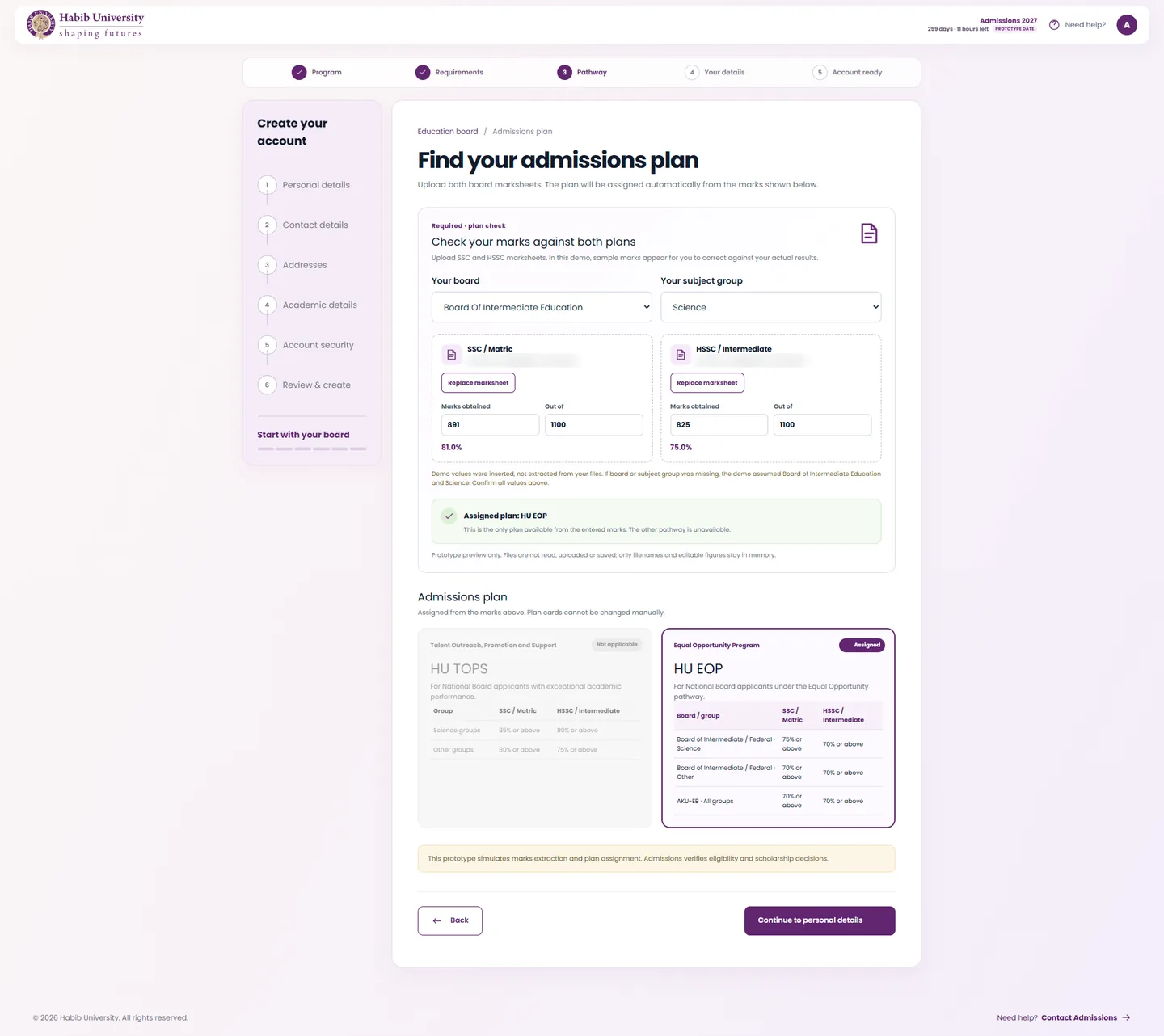
- Plan assigned from board, group and marks
- The other plan is shown as not applicable
Tell us once
Account creation is six short steps. What the applicant already shared travels forward.
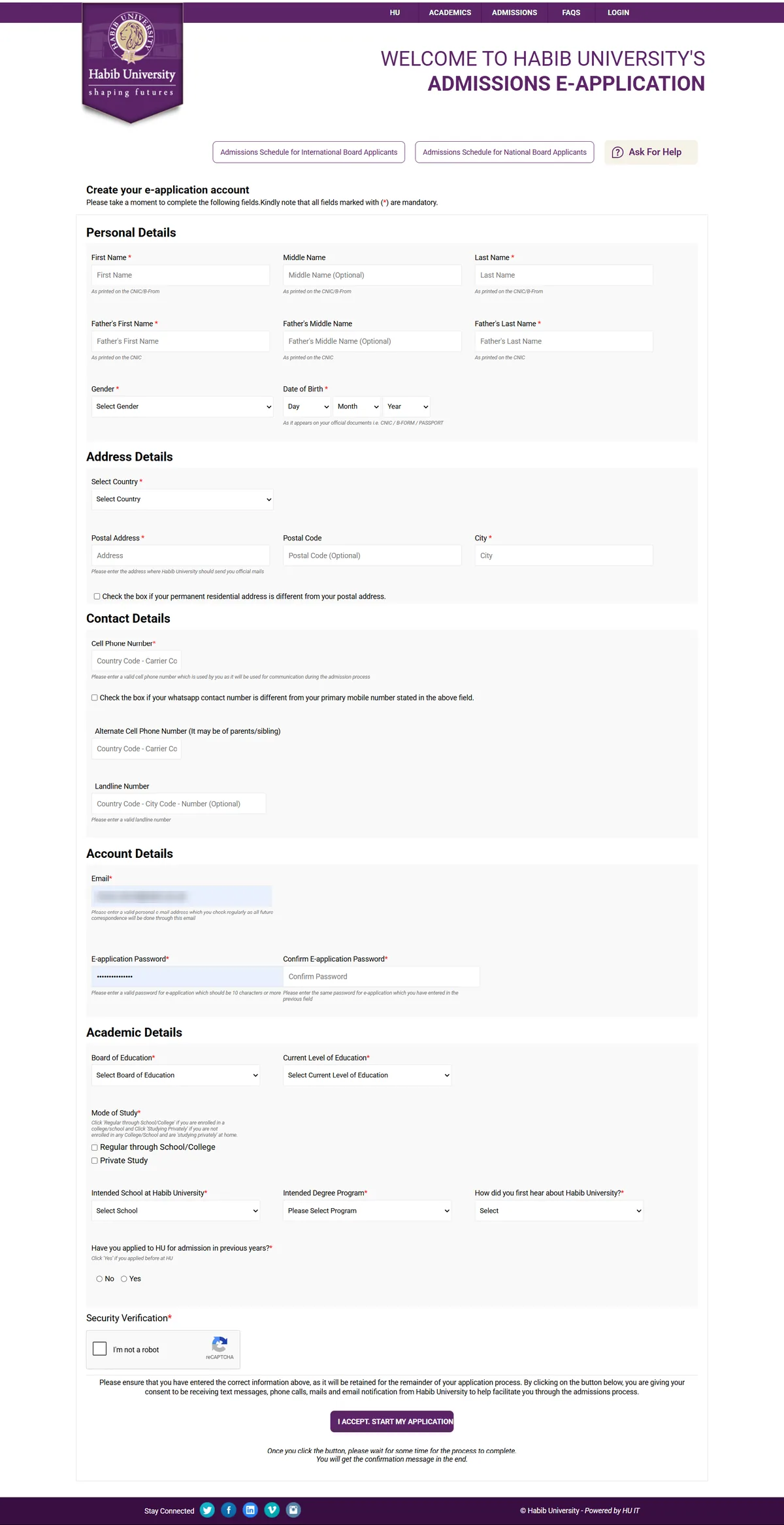
- 25 fields on a single page
- Personal details asked again later
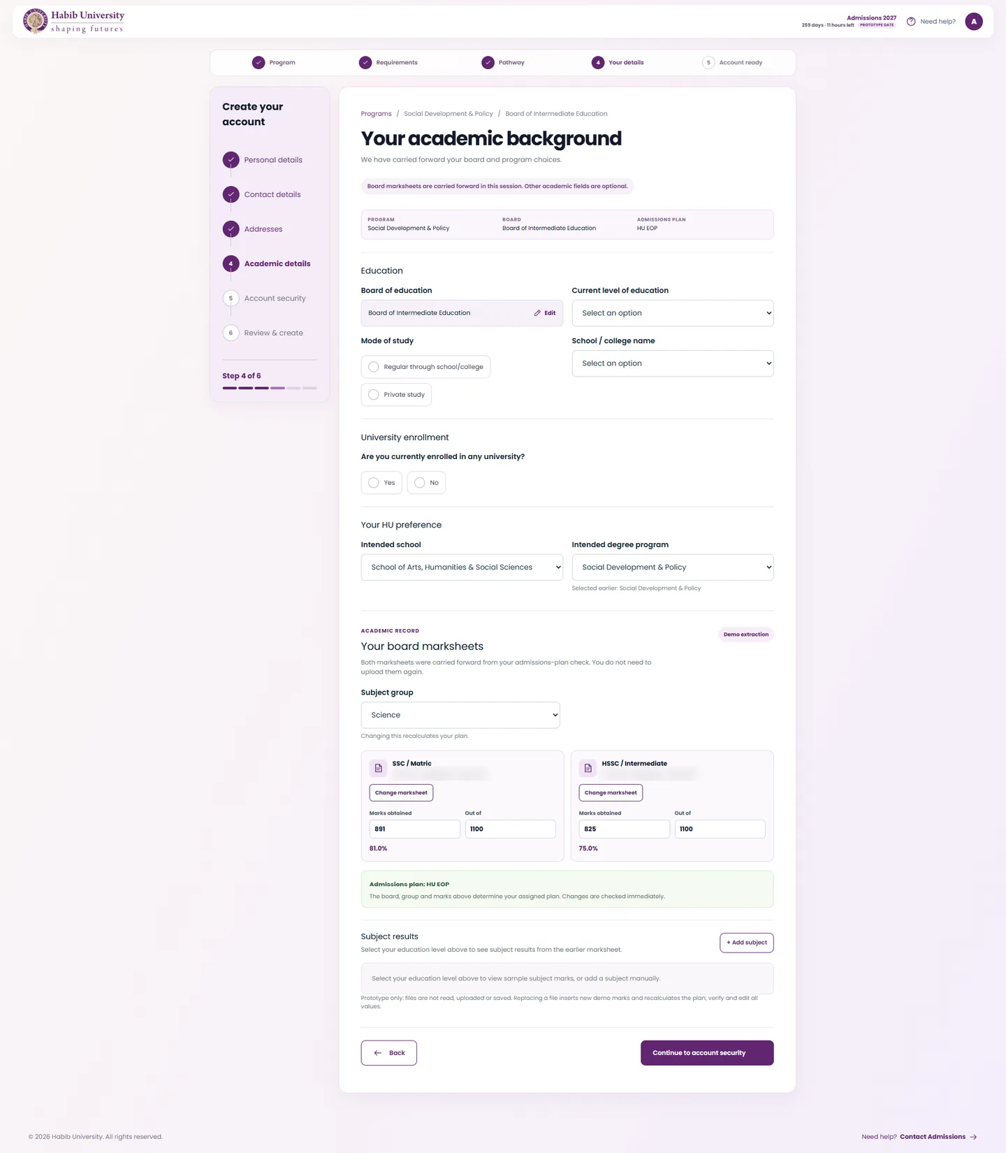
- Program, board, plan and marksheets carried forward
- Replace a marksheet, never re-upload by default
A dashboard that shows what is next
Every section has its own status. The applicant always knows where they stand.
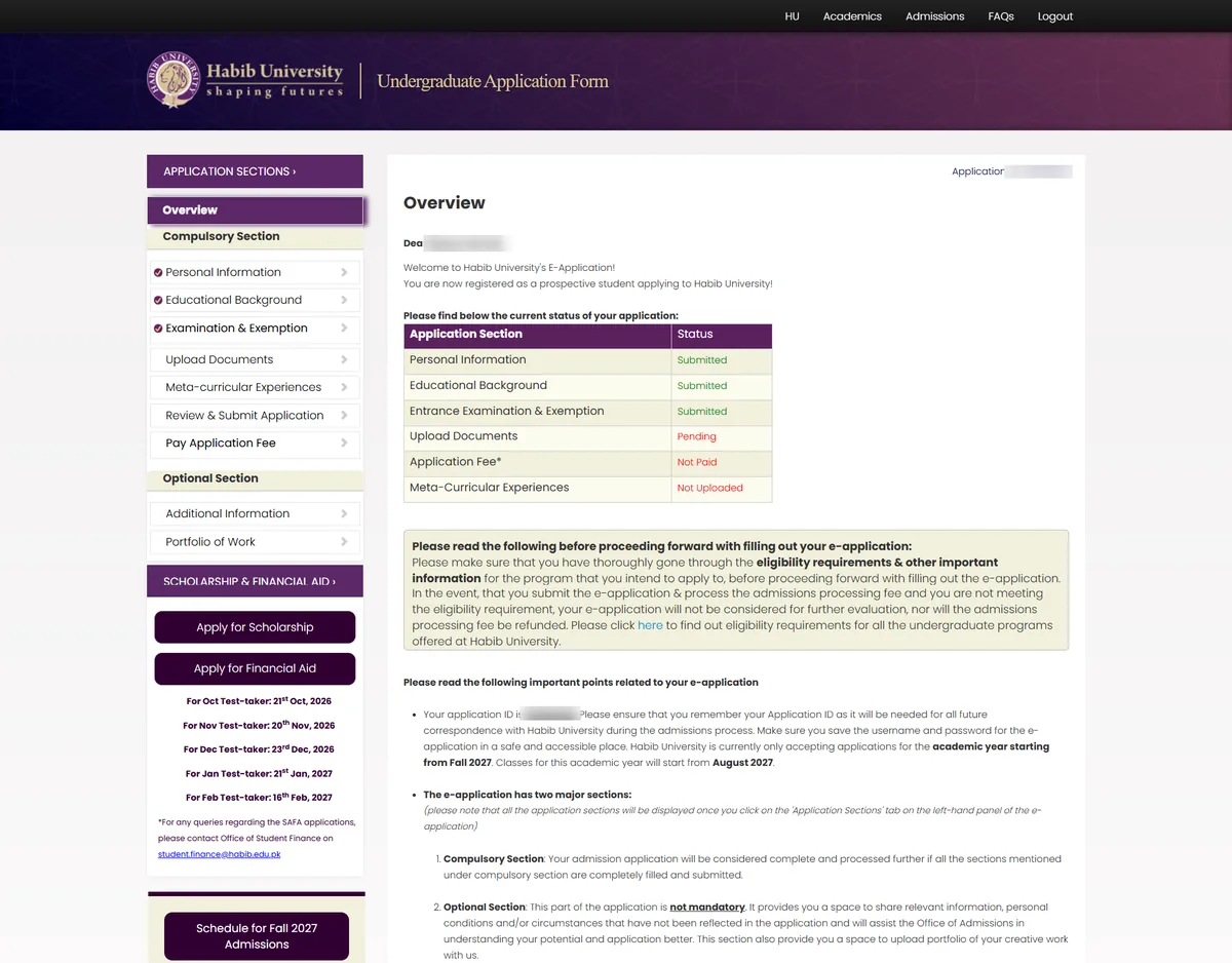
- A text wall and a status table
- Sidebar crowded with dates and buttons
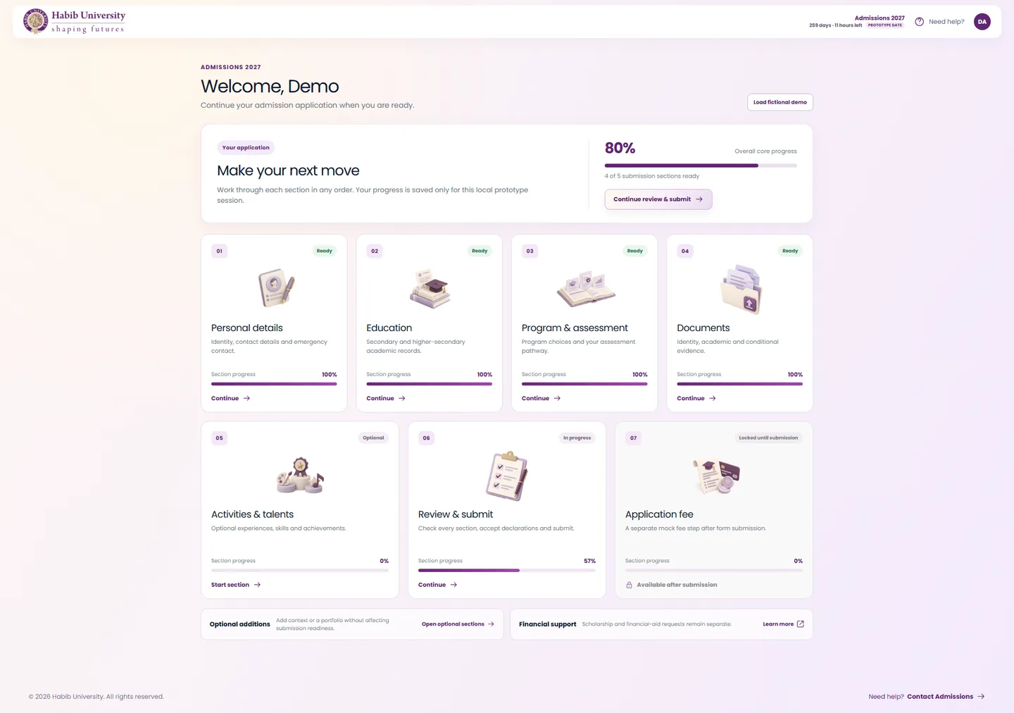
- Seven cards, each with its own progress
- One clear next action
Program and assessment
The first choice carries over. The assessment path is a plain choice, not a policy to decode.
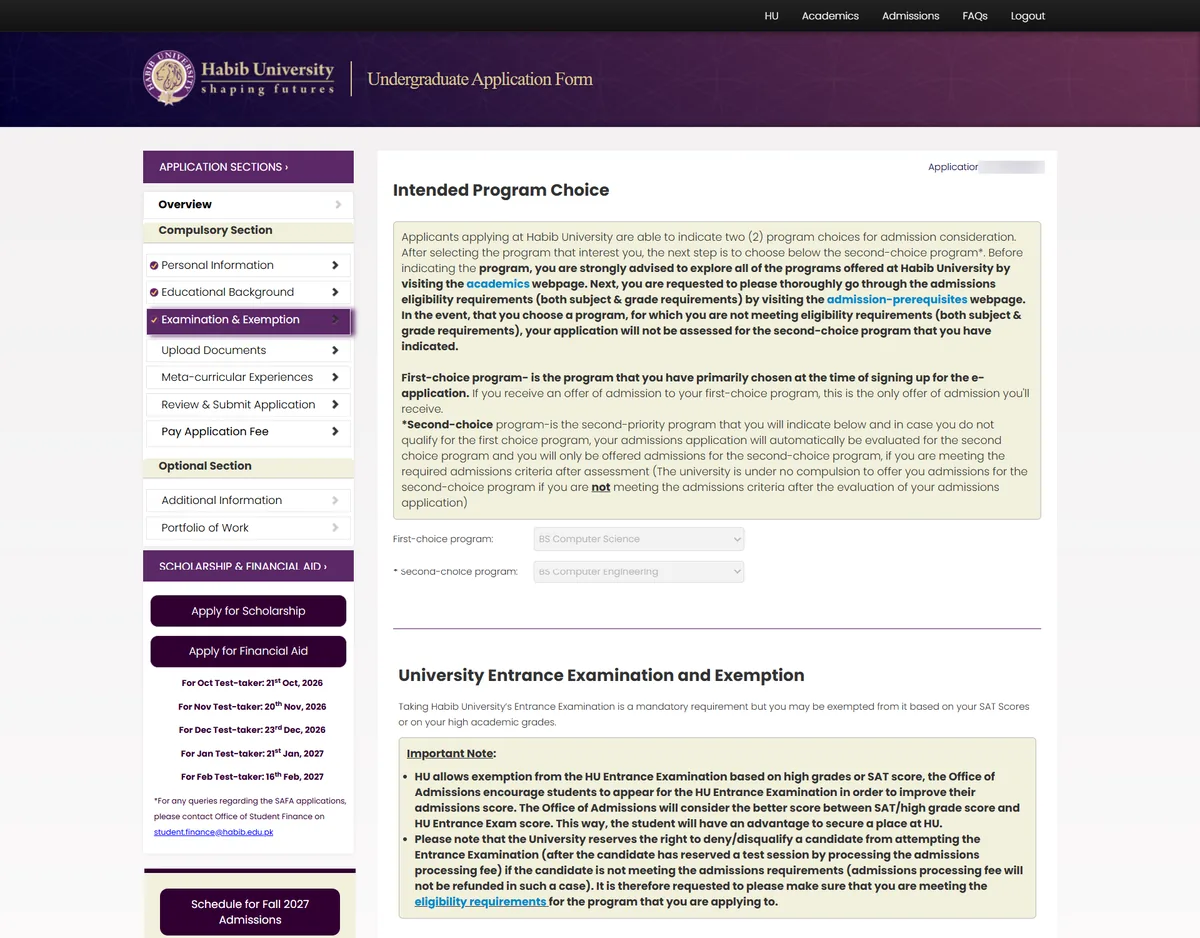
- Policy paragraphs before the choice
- Test sessions tied to the fee and submission
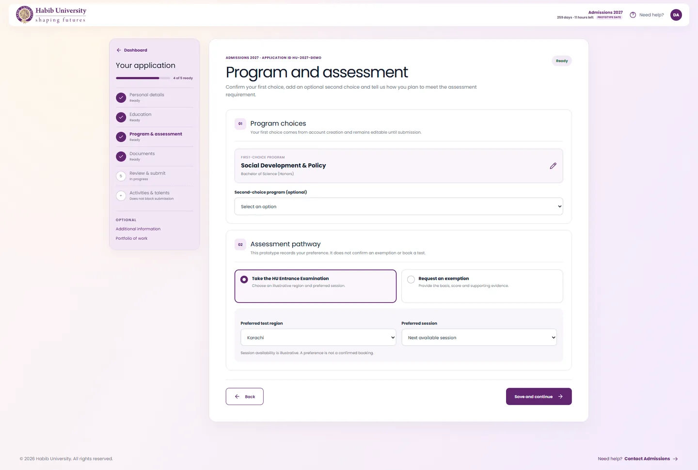
- First choice carried forward, second optional
- Exam or exemption, with the session marked as a preference
Review, then submit
Submitting means submitting. Nothing hides behind a pop-up.
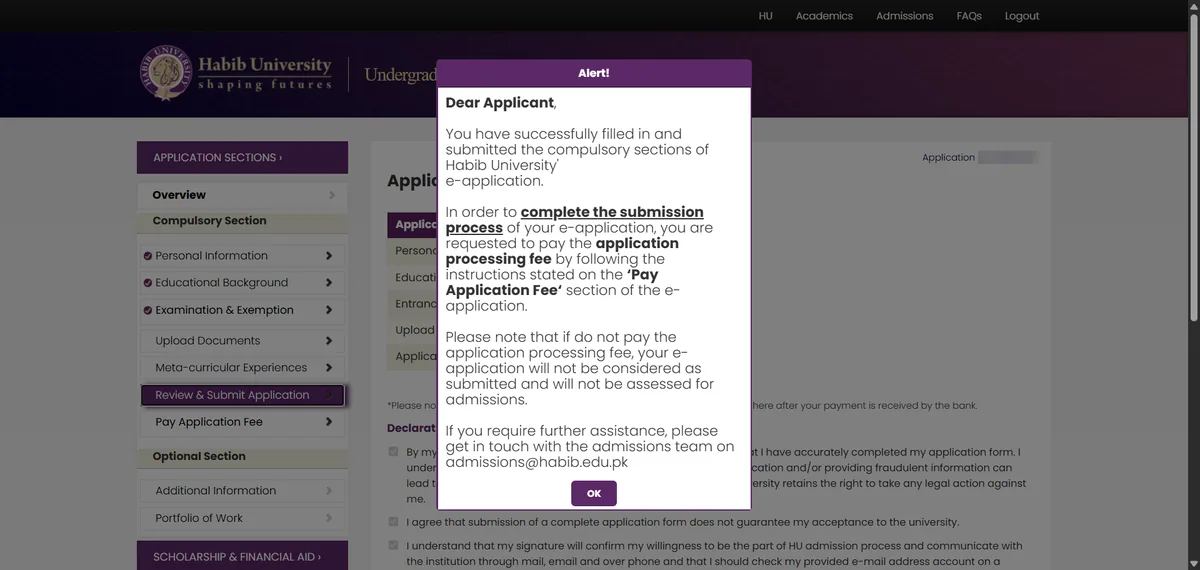
- “Submitted”, but only once you pay
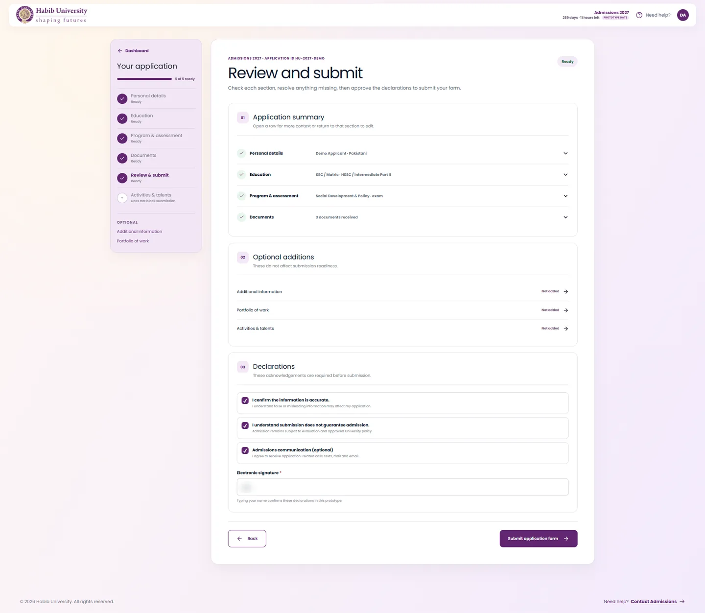
- Summary rows with Edit links
- Optional sections stay optional
The fee, as its own step
Form status and fee status are never mixed. The fee opens once the form is in.
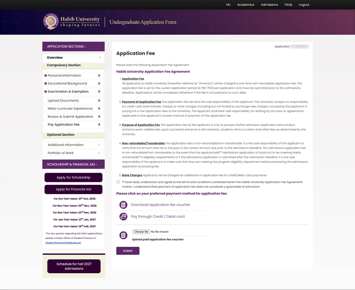
- A wall of agreement text
- Download a voucher, pay, upload the proof
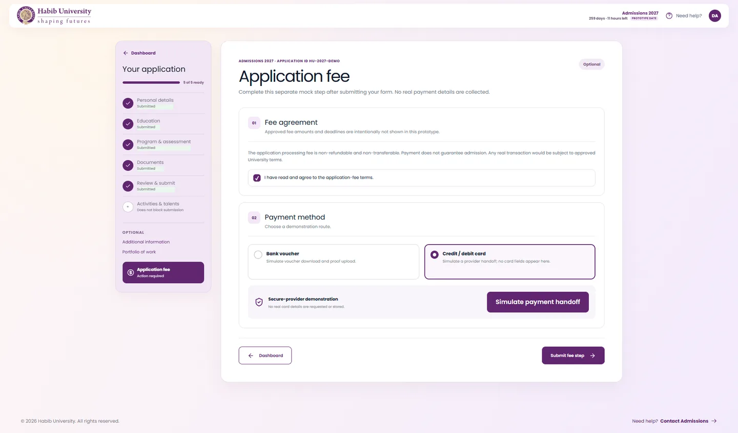
- Opens only after the form is submitted
- Voucher or card, in one place
03 — More screens
The steps in between
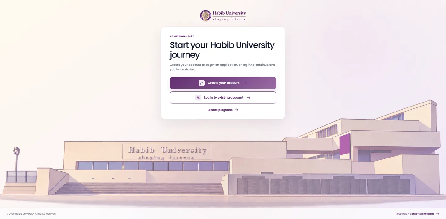
WelcomeCreate an account, log in, or explore programs.
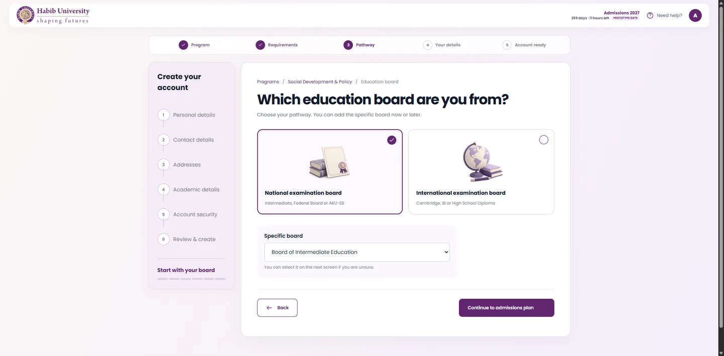
Education boardNational or international, with the specific board optional.
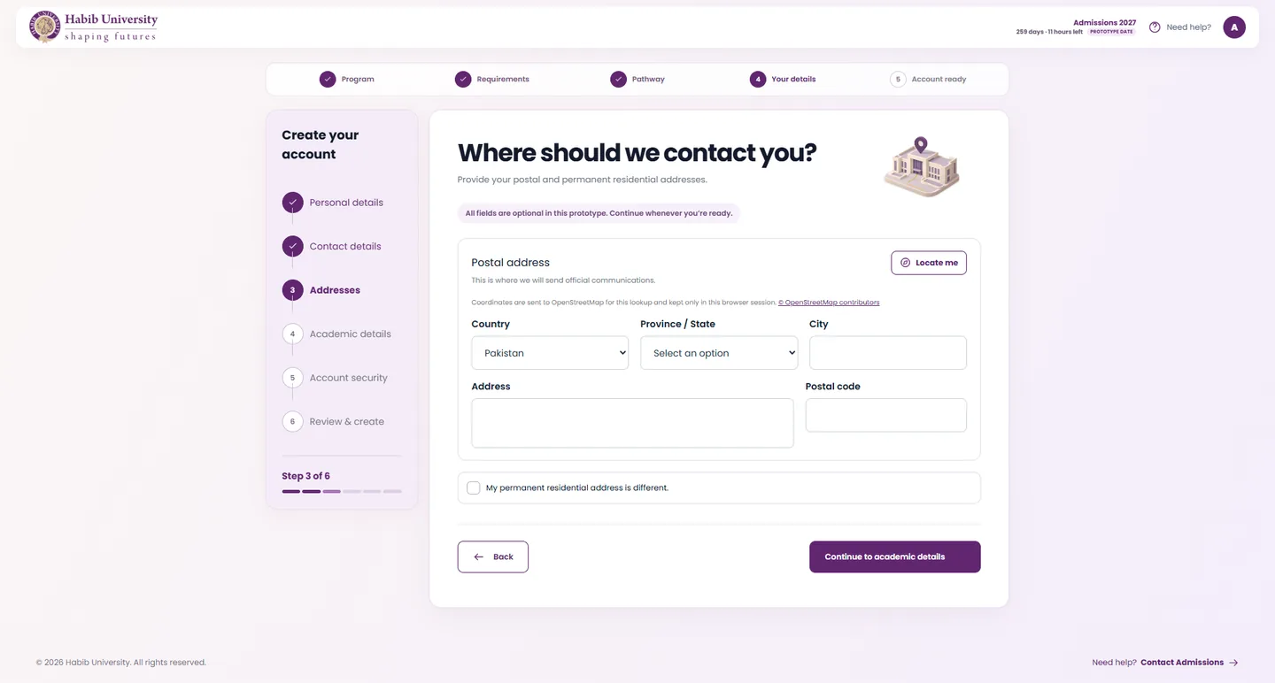
AddressesStep three of six. Fields stay optional until submission.
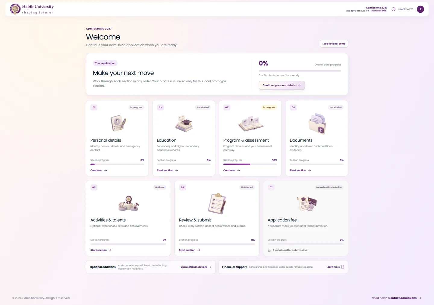
A fresh dashboardZero percent, one obvious place to begin.
04 — Design principles
Calm, clear, and honest about status
One clear next action
Every screen has one dominant button and a way back.
Carry data forward
Choices and marksheets from signup fill the sections that follow.
Segment complexity
Long forms become short cards, each with a one-line purpose.
Explain status precisely
Uploaded is not verified. Submitted is not paid. Payment pending is not complete.
Validate late
Applicants can save a draft. Only final submission enforces the core requirements.
Keep optional optional
Activities, additional information and portfolio never block submission.
Ivory and pale lavender surfaces, a muted purple for action and a subdued gold for emphasis, with isometric illustrations to keep the process friendly.
A single geometric sans, bold for headings and light for body copy, keeps long forms easy to scan on any screen from 320px to 2560px.
05 — My part
From the problem to the pixels
What I did
- Identified the problem in the previous application
- Met stakeholders and data owners to learn what was asked, and why
- Crafted the experience and the interface
- Documented the requirements as a PRD
What changed for applicants
- Fewer questions, each asked once
- A clear order, with progress they can see
- Requirements and payment inside the flow