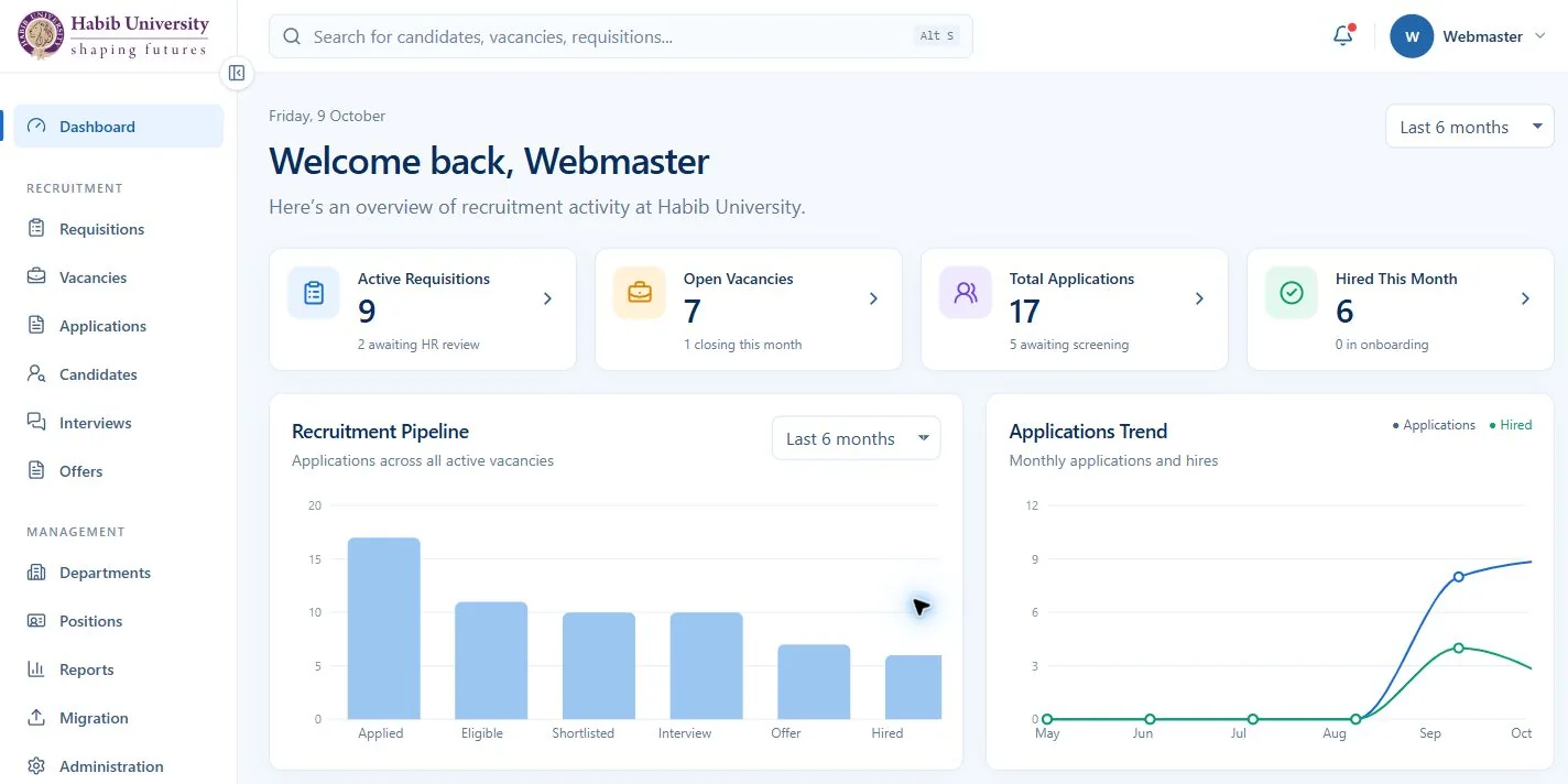
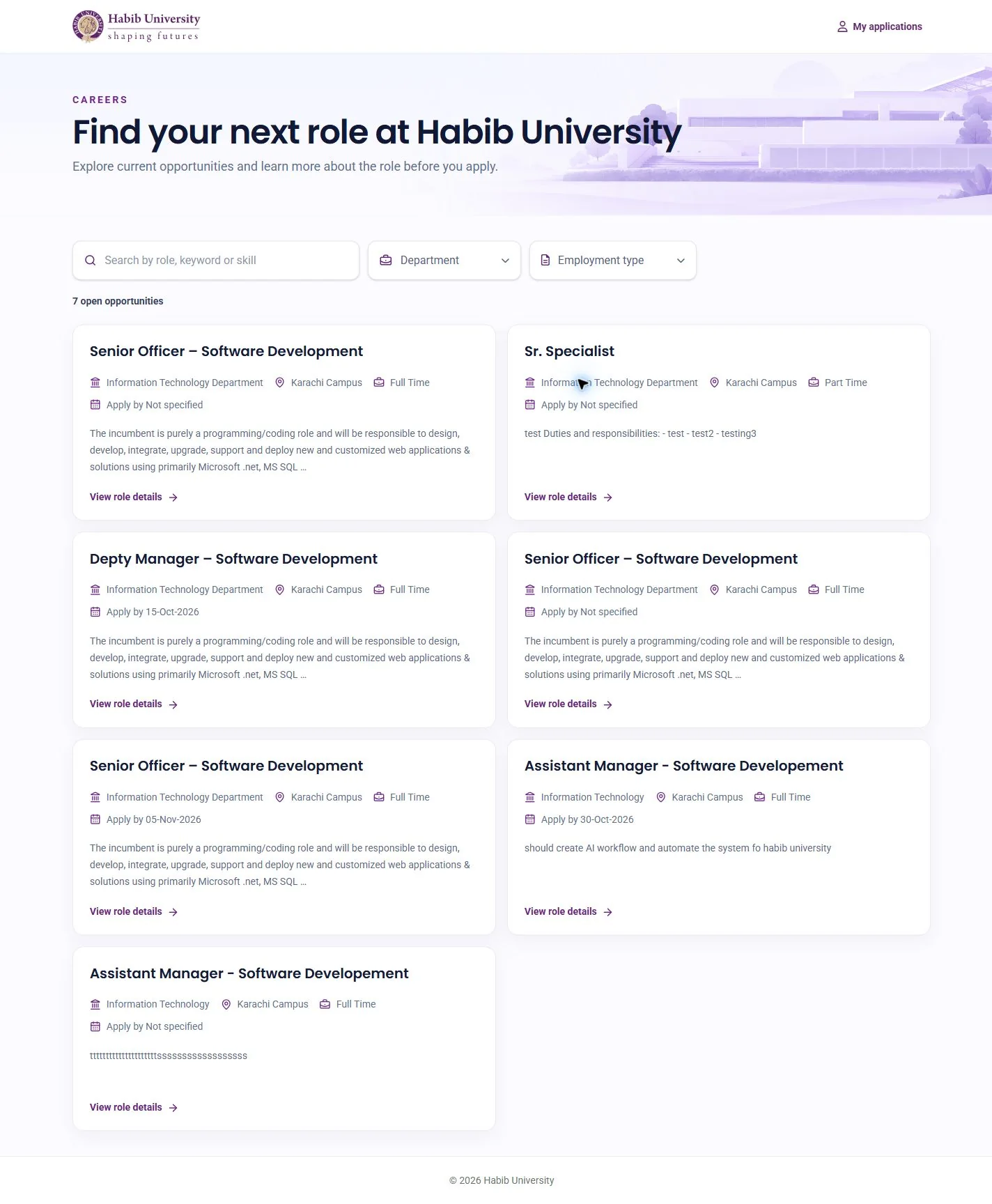
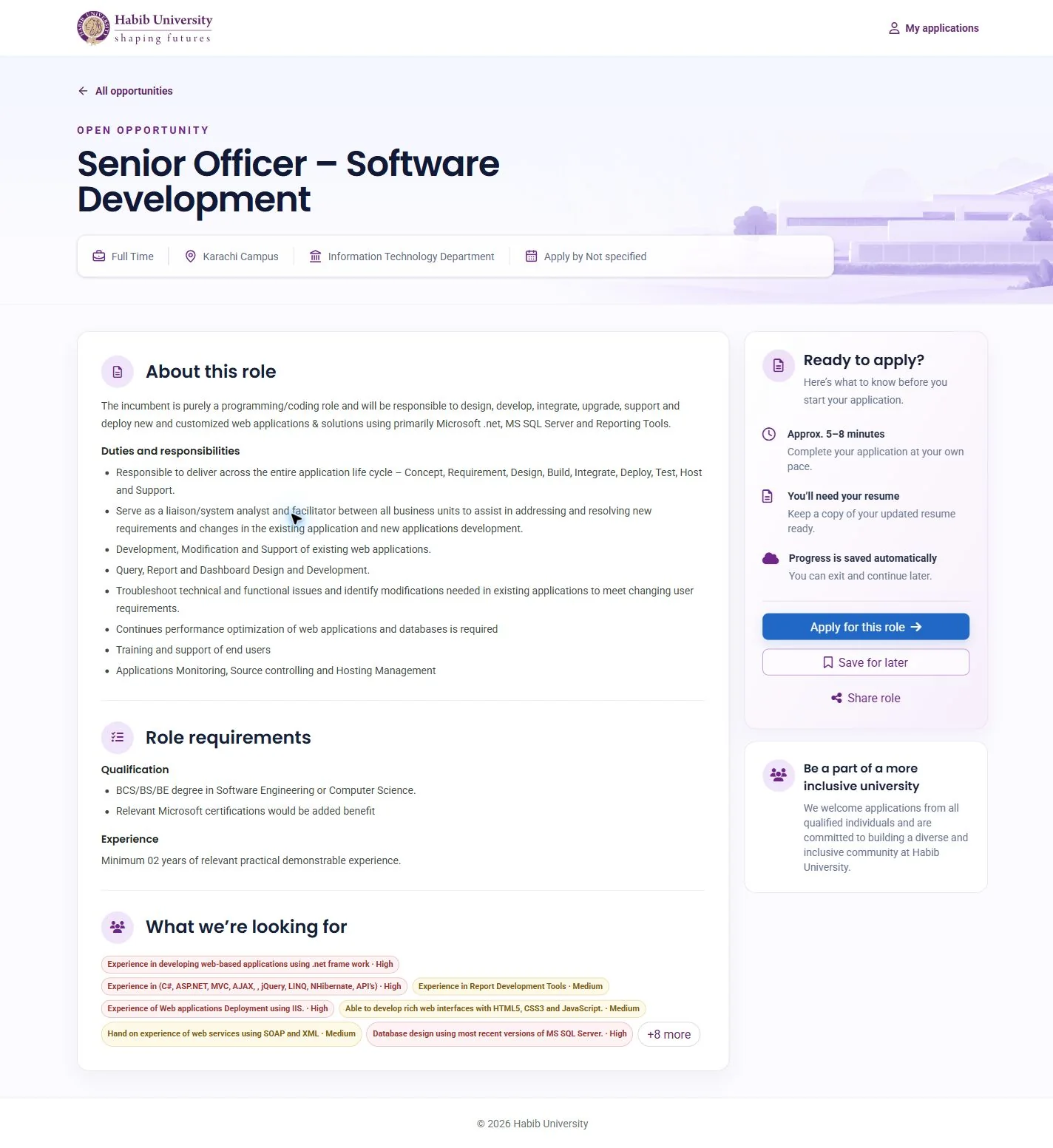
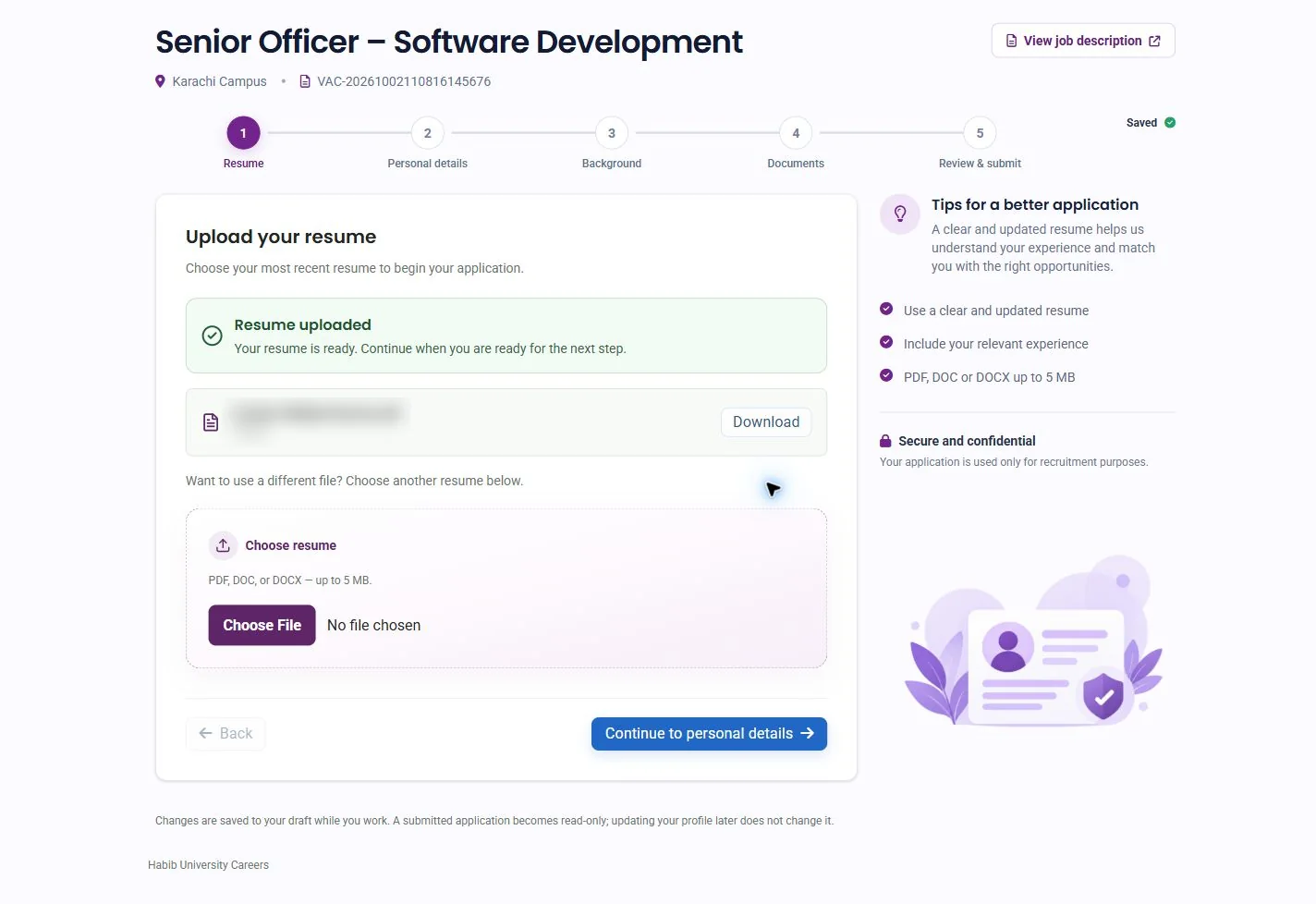
Hiring at a university involves many people: departments that need staff, HR who run the process, and candidates who apply. I designed one applicant tracking system that serves all of them, from a hiring request to a signed offer.
04 — Design system
Two interfaces, one system
Jobseekers and staff use the same product for very different reasons. A candidate is anxious and applying once, so the interface is warm and reassuring. A recruiter lives in it all day, so it is calm, dense and fast. I built one design system with two deliberate palettes, and a live component gallery that lets the team switch between them before designing a screen.
Two palettes
Requester, recruiter and admin
Primary blue#1663B6
Primary action#2167C5
Primary hover#12569E
Page navy#0B2C60
Heading navy#103466
Body blue-gray#5C7195
Canvas#F7FAFF
Surface#FFFFFF
Border#DCE7F3
Field border#CDDDEB
Focus blue#2370BB
DraftAwaiting approvalApprovedRejected
Blue for action and focus, navy for hierarchy. Status colours carry meaning on their own: amber waits, green is done, red stopped. The two palettes never mix on one screen.
Jobseeker
Primary purple#6F247E
Purple hover#581A66
Ink#121A37
Canvas#FCFBFF
Lavender#F4EDFF
Border#DED6EA
Success#159B62
Error#B33A3A
Under reviewVerified
Habib purple and soft lavender make applying feel friendly. Statuses stay calm and explicit, because a candidate is waiting on the answer.
Shared brand base
Habib purple#5E2568
Purple strong#461B4E
Gold#B58A3A
Accent#7A3B85
Warm canvas#FDFAF4
Both palettes grow from the university’s identity: purple and gold on a warm canvas. These tokens live once in the stylesheet, along with one focus ring for every control.
Typography
Inter, throughout staff screens
Page title
Section heading
Body text explains content and actions in a clear, readable way.
Eyebrow or label
Poppins and Roboto, for candidates
Find your next role
Section heading
Roboto body text supports a calm, clear and reassuring applicant experience.
Components
Staff components
Create requisitionCancel
All9Drafts1Awaiting approval2Approved6
9
9Total requisitions
Candidate components
Continue applicationSave draft
Before you submit: confirm your details and declaration.
Short explanations help applicants understand why their information is requested.
Rules that keep it consistent
44px fieldsVisible labels, a blue or purple focus ring, and the error written under the field it belongs to.
One icon setLucide outline icons at 16 to 22px, never hand-drawn one-offs.
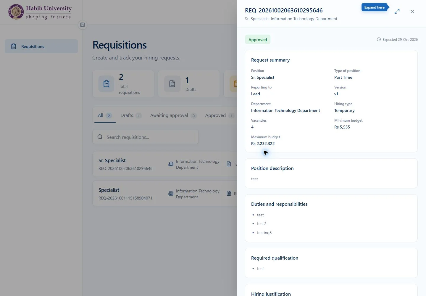
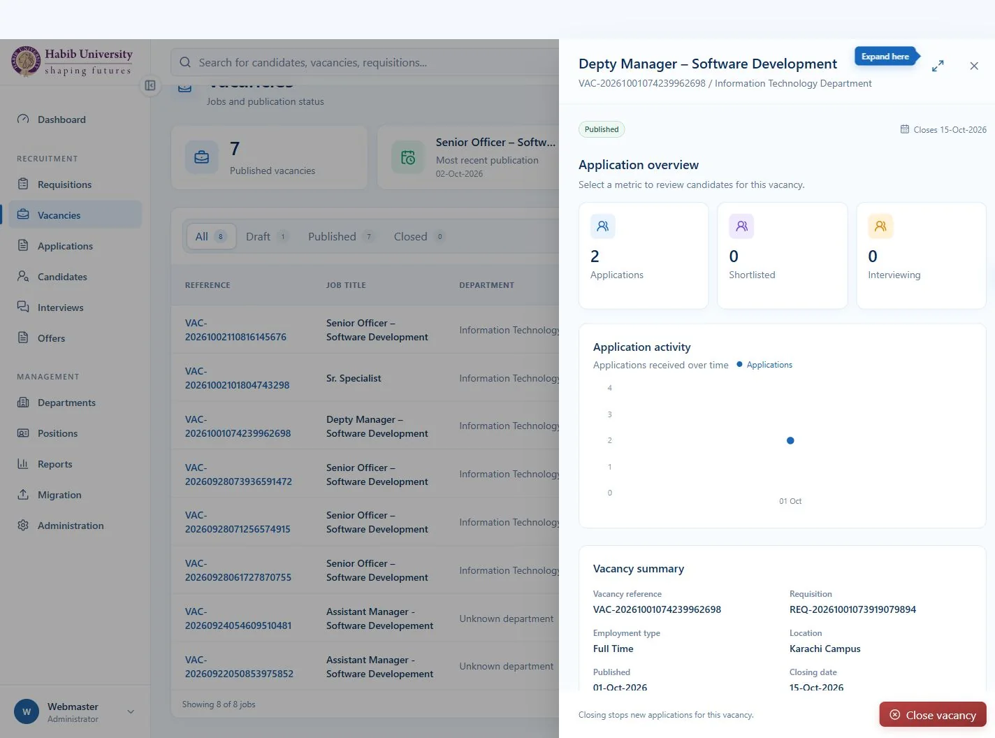
Drawer firstForms open in a 640px side drawer that can expand to full screen, so the list stays in view.
Every state designedHover, focus, disabled, loading, empty, error and success are part of each component, not afterthoughts.
Wrap, don’t scrollTabs and toolbars wrap before they scroll, so nothing hides at laptop widths or on a phone.
An 8px rhythmSpacing in 8px steps, compact cards, 8px controls and 12px content cards.
States covered on every server-backed screen
Initial loadingLoadedEmptyFiltered emptyAPI failure, with retrySavingSave failed, work keptSaved
05 — Administration
Roles are data, not code
An ATS only works if each person sees exactly what their job needs. I designed administration around permissions that HR can edit, so a role change never needs a developer or a new release.
1 · RoleAssigned in AdministrationHR edits roles and what each one may do.
2 · PermissionsSent with the userThe API returns a list such as vacancy.manage.
3 · CheckAsk what, never whoThe UI asks can(user, 'vacancy.manage'), never a role name.
4 · ResultMenu and actions adaptPages and buttons appear or hide. Edits apply when the window regains focus.
Hide what you can’t doActions a person can never perform simply aren’t shown.
Explain what is pausedIf a restriction is temporary, the control is disabled and says why.
The server has the last wordHiding a button is usability, not security. A refused action still shows a clear message.
Access
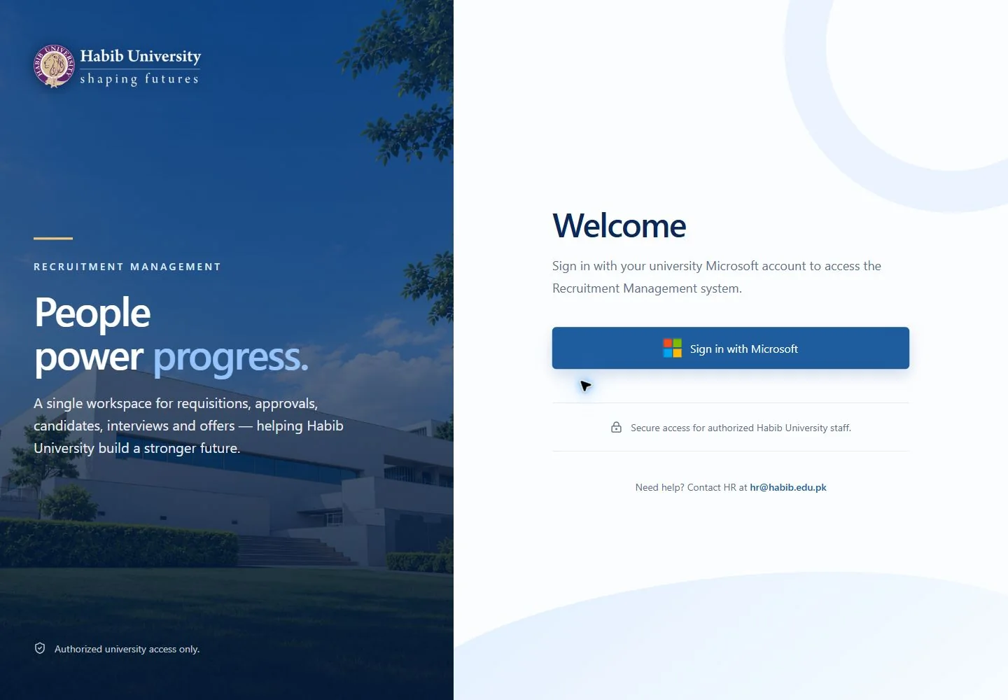
Staff sign-in
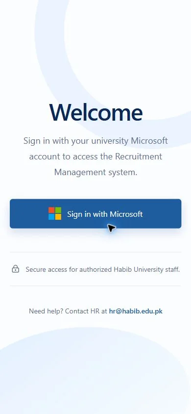
Staff sign in with their university Microsoft account. A person with no role assigned sees a clear “no access” message, and an expired session renews quietly before asking again.
Access
Roles and permissions
A catalogue of permissions grouped by area, assigned to roles in Administration. Navigation and page access follow from it.
Structure
Departments and positions
The reference data that requisitions, vacancies and reports depend on, owned by HR rather than hard-coded.
Insight
Reports
Recruitment numbers from the same lists staff already work in, ready to grow into server-side reporting as volumes rise.
Data
Migration
Import existing records from CSV. The file is checked and previewed in the browser first, so mistakes are caught before anything is saved.
Next
Planned
Multi-level approval workflows, theme and logo settings, and an activity log, each designed to plug into the same permission model.
02 — User personas and roles
Three people, three jobs
Jobseeker
Candidate applying to the university
Goal
Find a suitable role and apply without friction.
Worry
Losing progress, or not knowing what happens after submitting.
Design response
No password, autosave, a time estimate up front and a clear “what happens next”.
Requestor
Department head asking for new staff
Goal
Raise a hiring request and get it approved.
Worry
Not knowing where the request stands.
Design response
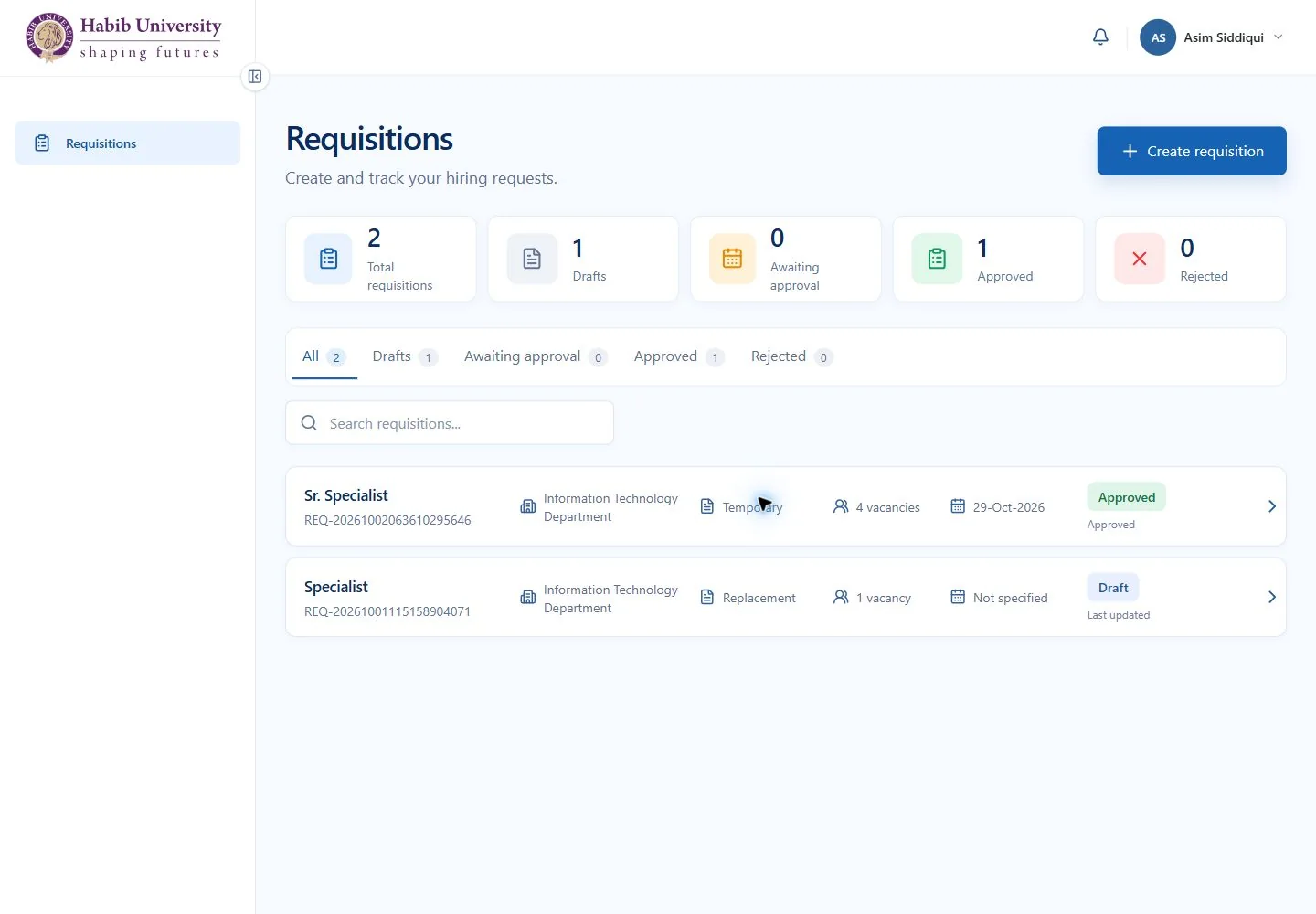
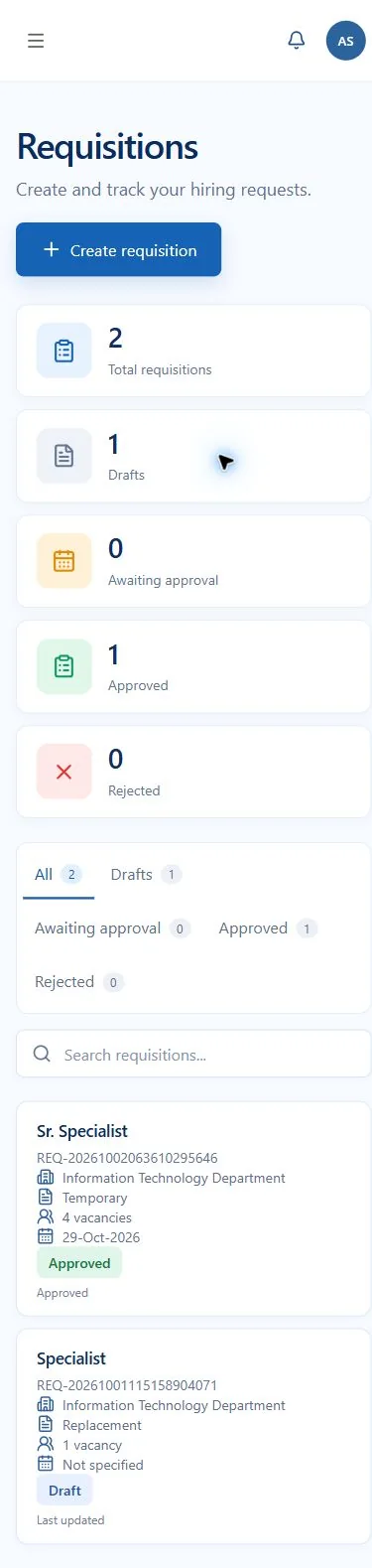
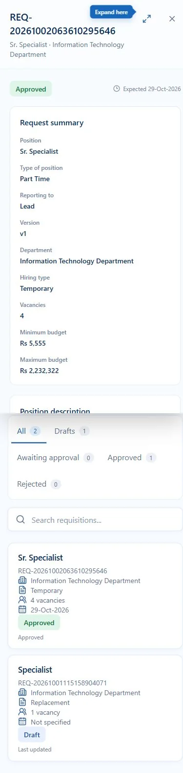
Status counts, a list with a detail drawer, and the same flow on mobile.
HR and admin
Recruiter running the pipeline
Goal
Move every candidate from application to offer.
Worry
Volume, inconsistent screening and scattered data.
Design response
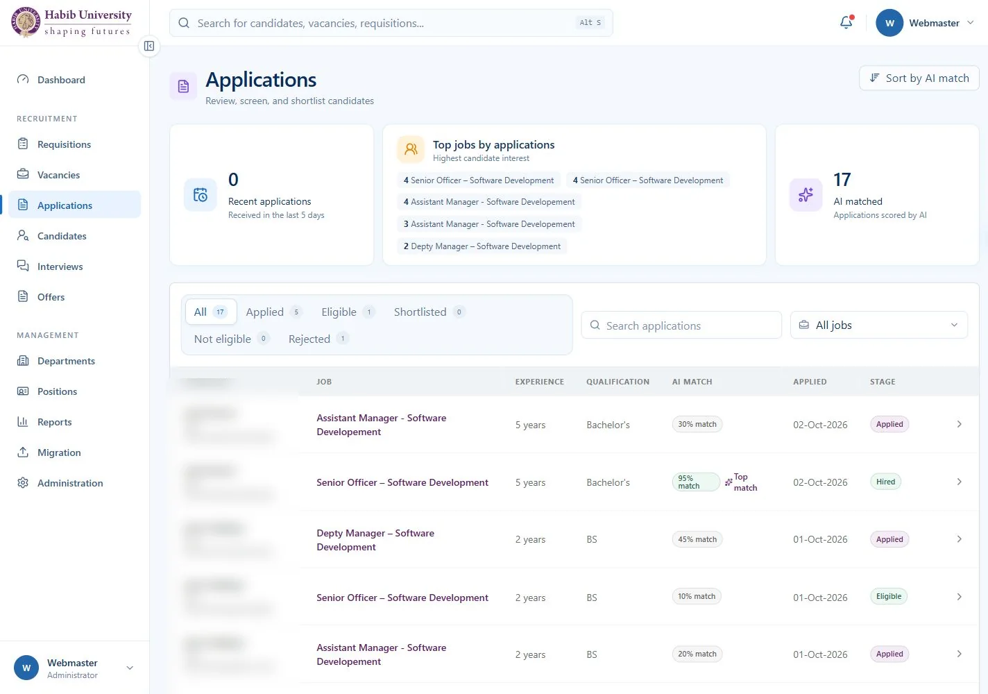
One workspace, a “Needs your attention” list and an AI match that explains itself.
What each role can do
Capability
Jobseeker
Requestor
HR and admin
Browse roles and apply
✓
Track own applications
✓
Create and track requisitions
✓
✓
Review and approve requisitions
✓
Publish and close vacancies
✓
Screen applications with AI match
✓
Schedule interviews and make offers
✓
Manage roles, reports and data migration
✓
03 — The system
Three roles, one pipeline
01
Jobseeker
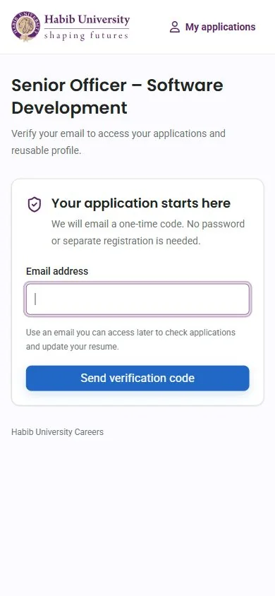
Browse roles, verify an email and apply, without creating a password.
No passwordA one-time email code replaces registration, so the first step is a single field.
Progress is never lostThe five-step form saves automatically and shows its state.
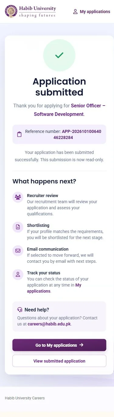
Clear expectationsA time estimate before applying, and a “what happens next” after submitting.
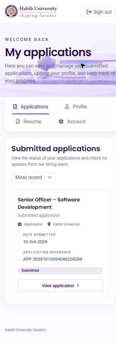
Jobseeker on mobile
02
Requestor
Department heads raise a hiring request and follow it through approval.
Sign in onceUniversity Microsoft account, no new credentials to manage.
Status at a glanceCounts for drafts, awaiting approval, approved and rejected.
Detail without leaving the listA side drawer shows the full request and expands when needed.
Requestor on mobile
03
HR and admin
One workspace to run the pipeline from requisition to offer.
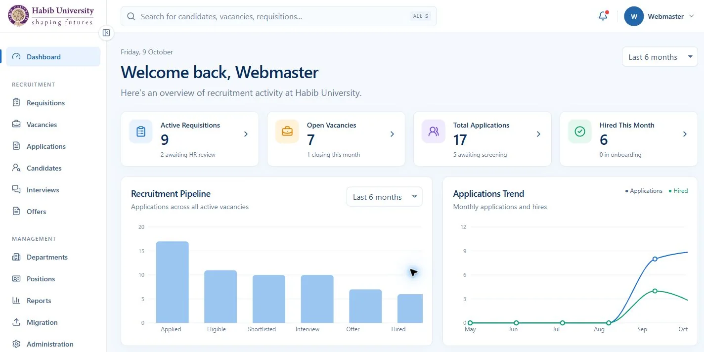
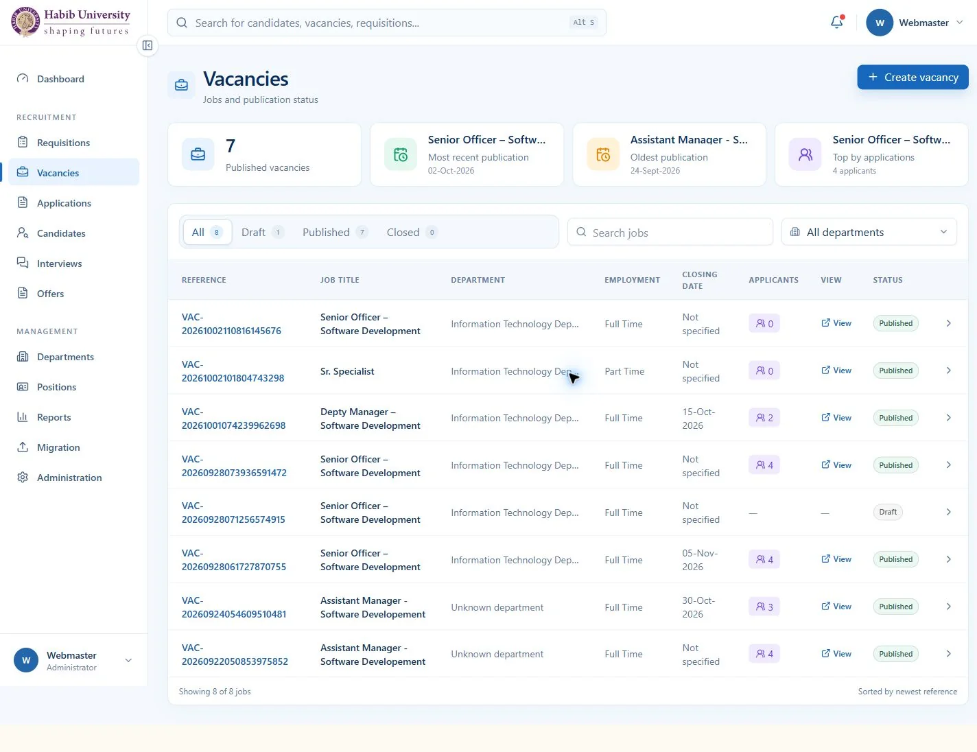
One pipelineRequisitions, vacancies, applications, interviews and offers share one navigation and one pattern.
Act, don’t huntA “Needs your attention” list on the dashboard links straight to the next action.
List plus drawerEvery record opens in a drawer, so reviewing ten candidates never loses your place.
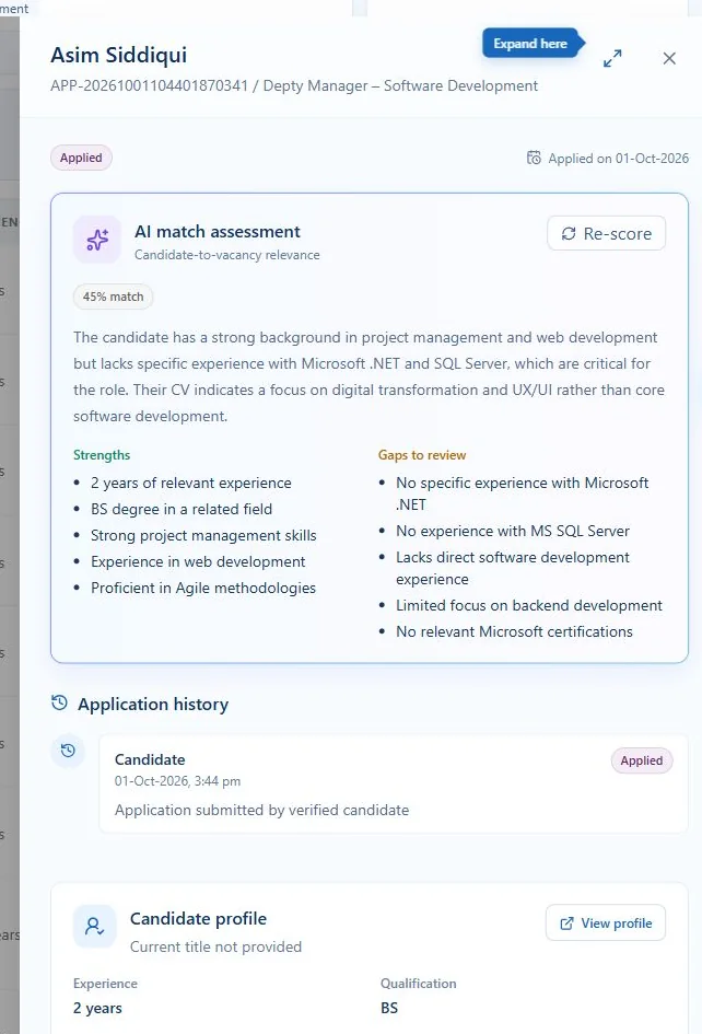
Explainable AI match
A score you can check
Each application gets a match score and a short written reason, with strengths and gaps to review side by side. Recruiters can re-score, and the final call stays with them.